Logo Design // “Blødt Igennem”
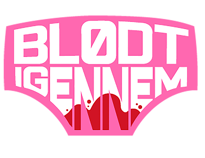
My logo design submission to the ”Blødt Igennem” (Bled Through) campaign. Created by: Danmarks Bløderforening. The winner logo should be worn by women with bleeding disorder in Femina Women’s Race in spring 2018*
Intent
I couldn’t resist the urge to make a provoking logo, once I had discovered the name of the campaign. I wish to make people look twice, and remember the logo, once they’ve seen it. The subject of bleeding through is emberasing to a lot of women, and therefore, it’s not talked much about. I’d like for my logo to create a sense of community, and that it’s okay to seek help – hence the superhero-esque logo.
Typography & Color
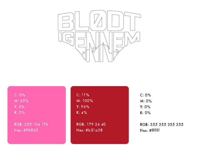
The font I’ve used for this logo is named: Industri Inc Base
Other fonts used: Futura
These fonts are to be used, and are supposed to create a larger whole, with the other elements.
Priorities of importance
• The logo must be easy on the eye and recognizable.
• Aim to spread awareness about bleeding disorders.
• Aim to help more women get help when they’re living with severe bleedings.
(In short:)
Get women who suffers from severe hemorrhage, to take contact to their medical doctors, to get examined, and find out whether or not they have a bleeding disorder.
This is how the logo would look like on a tank-top. – The picture to the right is borrowed on this page
*This logo is NOT the winner logo. This is my submission for the campaign, not to be confused with the final winning logo, as you can find on this link.


